Choosing the right mat
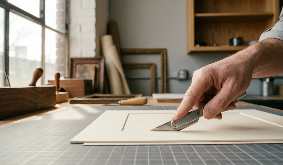
People often think of the mat — the card border between the artwork and the frame — as decoration. It is, a little. But its first job is space. A mat gives the eye somewhere to rest before it reaches the frame, and it keeps the surface of the work off the glass, where trapped moisture and contact would otherwise do damage over time. Get the mat right and the frame almost chooses itself.
Start with width
The most common mistake is a mat that is too narrow. A thin border reads as hesitation; a generous one looks deliberate. As a rough starting point we like the mat to be a little wider than the frame moulding, and for small works we rarely go below five centimetres. Larger pieces can carry eight or ten. The image should feel like it is being presented, not squeezed.
There is an old trick of making the bottom border slightly deeper than the top and sides — "weighting" the mat. The eye reads a perfectly even border as very slightly bottom-heavy, and the small extra at the base corrects it. It is subtle, and on contemporary work we often skip it, but on traditional pieces it still earns its place.
Then colour
Off-white and cream do most of the work in this studio, and for good reason: they recede, they flatter almost everything, and they date slowly. A bright white can look crisp against bold, modern work but harsh against an old photograph or a warm watercolour. Coloured mats have their moment, but we treat them carefully — a colour pulled from within the artwork usually sits better than one that competes with it.
A mat should support the work, not perform next to it.
Single or double
A double mat — a second, usually darker, board showing as a thin line at the bevel — adds a little depth and draws a quiet border around the image. It suits prints and photographs well. A single mat is cleaner and often right for simple or very modern work. Neither is more "correct"; it depends on how much the piece wants framing and how much it wants to be left alone.
Why the board itself matters
Whatever the colour, the board should be acid-free and lignin-free right through, not just on the surface. Cheap mats have a buffered face over an ordinary core, and within a few years that core browns and the acid migrates into the artwork — you have seen the tan line around old framed photos. That line is the mat, not age. We only cut conservation-grade board, because the mat is the material in closest, longest contact with the work.
None of this has to be decided in the abstract. Bring the piece in, and we will lay a few mat corners over it on the bench — you will see the right one almost before we do. If you would like to read on, our note on why acid-free matters goes deeper on the board itself.